Jobbkompassen platform optimization
- Current status
- Completed university project
- Project type
- Group project (3)
- Timeline
- 1 month
- Outcome
- Analytics dashboard and prioritized recommendations based on mock platform data.
TLDR
We evaluated Jobbkompassen to understand how jobseekers and employers moved through its search and contact flows. The project used mock platform data together with user feedback, so the goal was not to pretend that we had discovered proven behavior from the live service. Instead, we translated the platform's goals into questions that could be measured and created a dashboard where the answers could be compared.
The analysis focused on search keywords, failed sessions, visit duration and the points where people continued or left. This gave us a shared view of the service and a direction for improvements such as better filters, more relevant job matches, CV tools and a redesigned search experience.
Because the data was simulated, these are directions to explore rather than proven solutions. The next step would be to compare them with real behavior and see whether the same problems actually appear.
What we wanted to understand
A conversion rate can tell you that something is happening, but it does not explain why. If few jobseekers move from a search to an application, the issue could be the search results, the words people use, an error in the flow or something else entirely.
So we began with questions:
- Where do people leave the search flow?
- Which search terms result in applications?
- Where do errors interrupt the experience?
- How long do people spend on the platform before applying or leaving?
- Are employers reaching the point where they contact a jobseeker?
These are simple questions, but answering them requires events, pages, inputs, sessions, timestamps and error codes to be connected. Looking at each number separately would not explain much.
Measurement
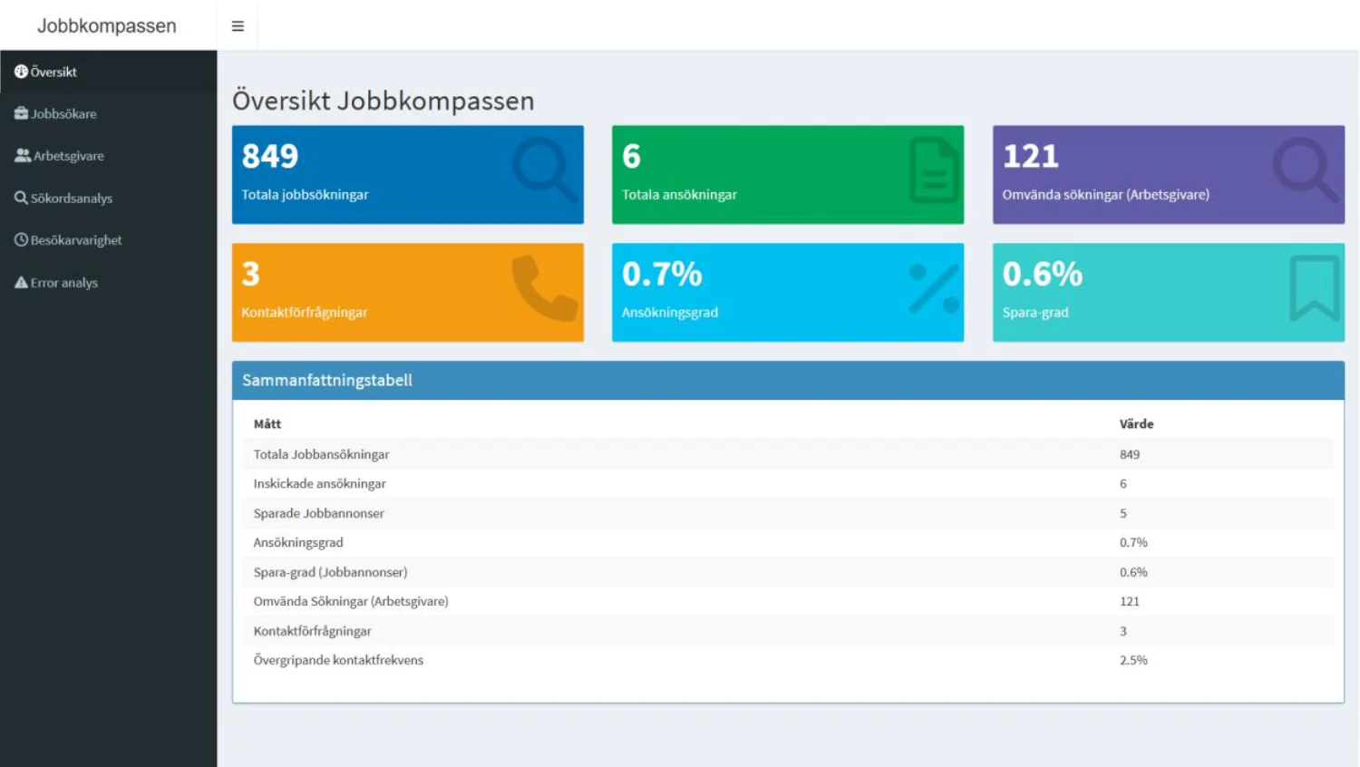
We defined two primary measurements. The conversion from job search to application was 0.7 percent, whilst the employer contact rate was 2.5 percent.
We then used three areas of analysis to add context:
- Search keywords: We compared the words people searched for with application and conversion behavior.
- Errors: We isolated failed search sessions to see where the flow stopped working as intended.
- Visit duration: We examined how long people spent moving through the service before continuing or leaving.
Does a longer visit mean that someone is more engaged? Perhaps, but it could also mean that they are struggling to find what they need. The number only becomes useful when it is compared with the actions that happened during the same session.
Dashboard
We built a dashboard with separate views for Overview, Jobseekers, Employers, Keyword Analysis, Visit Duration and Error Analysis.
Funnels showed where sessions ended, whilst the charts made search behavior, visit duration and errors easier to compare. The separation also made it possible to look at the service from the perspective of a jobseeker or employer without losing the shared overview.
The purpose of the dashboard was not to fill a screen with numbers. It was to create one place where a discussion could begin with the same information. Which searches work? Where does the service fail? Which problem should be looked at first?
Recommendations
The analysis created several directions for improving the service:
- Introduce more advanced filters for skills, industries and other search criteria.
- Add CV building tools and templates so profiles become more useful to employers.
- Prioritise specialised job titles more intelligently instead of relying too heavily on generic matches.
- Explore AI assisted matching between jobseekers and employers.
- Redesign the search interface and resolve language inconsistencies.
These recommendations follow from the questions explored in the dashboard, but they still need to be tested. A filter may make searching easier, for example, but adding more controls can also make the interface harder to understand. The direction makes sense. The final solution still depends on what happens with actual users.
Outcome and limitation
The outcome was a shared analytical view that showed where users left the search flow, which keywords resulted in applications and where errors interrupted the experience. This gave us a clearer direction for improving the service.
However, the project used mock data. I cannot claim that the findings represent how people actually use Jobbkompassen, and the recommendations should not be presented as proven solutions. The next step would be to use live behavior, compare devices and speak with users experiencing the same parts of the flow.
Research can suggest one thing, but you never know for certain until it meets reality.