Greater Scene (Full product)
- Current status
- Planning beta testing
- URL
- greaterscene.compassword: gXedVkp9vDKk
- Project type
- Solo project
- Timeline
- July to present (in active development)
TLDR
Image generation models can already edit property photos of course, but flexibility alone does not create a practical workflow for the user. Can someone upload an image and explain what they want changed? Indeed they can, but this requires them to know what they want and how to properly prompt it.
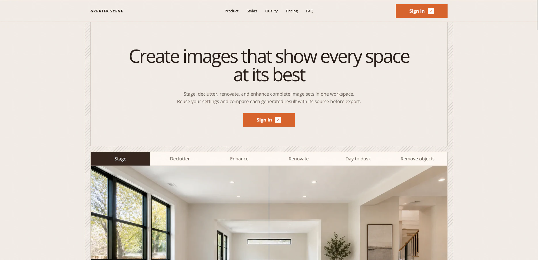
Greater Scene keeps source images, effects and generated results together in one workspace. The user can work with several images, generate more than one result at a time and continue iterating whilst other generations are running. Guided effects also replace much of the repeated prompting with a few relevant choices.
The product has been tested technically through automated tests, different browsers, persona based flows and edge cases. But it has not been fully validated by actual users. The next step is to test whether property professionals understand the flow, trust the results and find enough value in the product to pay for it.
Product roadmap
- Implement technical SEO.
- Build internal tools that automate parts of the marketing workflow.
- Test the product with actual users before expanding the feature set.
Role
I have led Greater Scene from the initial idea through product strategy, research, UX, UI, the design system, technical direction, testing and launch preparation.
I use AI coding agents to turn detailed requirements into production code. Does this mean every generated implementation is automatically good? Of course not. Something can technically work whilst still being inconsistent, poorly designed or completely different from what I intended. A large part of my role is testing the result, spotting where it has drifted, rejecting weak solutions and turning accepted decisions into rules that can be reused.
My strength is not pretending to be traditionally specialised in every technology behind the product. It is being able to direct AI assisted product development whilst keeping the experience, visual system and technical implementation connected.
The opportunity
I have used AI image generation since the earlier models became available, so I already knew the experience from the user side. When I use a product, I tend to notice where the flow asks more from the user than it should.
An empty prompt offers a lot of creative freedom, but it also expects the user to know exactly what they want and how to explain it to the model. What happens if they know something looks wrong but cannot describe the change? They can continue prompting, use something such as Magic Prompt or start again, but the work is still left to them.
Handling several images can make this even messier. The user may have to describe them as the first image, second image and so on, or process them individually. If they notice something wrong with the second result whilst already working on the sixth, they have to bring the earlier image back into context and explain the change again. They could keep several chats open at the same time, but now they are managing more than they are supposed to.
I reviewed AI staging products, general image editors and human property imaging services during the early research. This was directional desk research, not proof of the entire market. The products I reviewed often relied on the same prompt flow, handled property images as isolated jobs or charged prices that felt difficult to justify based on the state of the experience. So there appeared to be a gap worth exploring.
How the product works
Greater Scene uses external image generation providers. The product is built around what happens before, during and after the generation:
Property, images, guided effects, output choices and independent generated versions.
The user should not need to understand which provider is being used or how to phrase every instruction for it. They should understand what they want to do to the property image, what it will cost and where the result will appear.
1. Design around the property
The problem
A property rarely contains one image. There may be several rooms, exterior photos and results that need further changes. Uploading several images is not a problem by itself because many services already allow it. The problem begins when the user has to repeatedly explain which image they mean, wait for each one or bring an earlier result back into context to make another change.
The decision
I made an infinite canvas the main workspace. One file can contain several source images and independent generated results. The user can select more than one image, resize them without changing their proportions, compare the source with the result and use a generated image as the starting point for another supported effect.
The wider structure follows the same thinking. All files is the default overview, whilst projects are optional. A new user can create their first file without deciding how everything should be organised. Someone with more work can introduce projects later. Favorites make important files easier to find, and Trash separates recoverable files from active work.
The tradeoff
The canvas is more complicated to build and explain than a single upload screen. It introduces questions around performance, responsive behavior, selecting images and onboarding. Is it still worth it? I believe so, because it allows the user to keep the property and its results together instead of moving between separate jobs.
But this is still an assumption. Actual users need to show whether the canvas helps them or simply gives them more interface to understand.
2. Replace the chatbot with guided effects
The problem
I initially explored using a chatbot because people already understand how prompting works. But a chatbot also allows the user to ask for almost anything, including something that conflicts with the effect or produces a result different from what the interface appeared to promise.
Creative freedom is a nice feature. However, it also means that the user has to make more decisions and understand how to communicate with the model.
The decision
I removed the chatbot and replaced it with guided effects such as virtual staging, renovation, decluttering, day to dusk changes, lawn enhancement and pool enhancement.
The user chooses what they want to accomplish and only sees the options related to that effect. Completed choices remain visible and can still be changed. Instead of writing a lot, they click a few times.
The tradeoff
The tradeoff is of course that guided effects remove some creative freedom. Each new effect also needs to be deliberately designed, tested and maintained.
But if someone is already using Greater Scene, another empty prompt may not be what they want anyways. The product is for someone who wants to reach a supported result without having to understand everything the model expects from them.
3. Make spending credits clear
The problem
Applying an effect and generating an image are two different actions. Generation spends credits and sends work to an external provider, so the user should understand when they are still preparing the image and when they are actually committing to the result.
The provider also does not expose progress information that would support a truthful percentage or estimated completion time. Showing 72 percent may look helpful until it stays there for three minutes. Then the user may think something is wrong or that the product is simply slow, even though the percentage was never connected to real progress.
The decision
Having an Apply step introduces another action before the user can generate. Is it necessary? I believe so, because it allows them to review the effect, output settings and credit cost before anything is spent.
Source images and earlier results are never silently replaced. During generation, the product uses an indeterminate shimmer and messages related to the work without pretending to know the exact progress. Errors also explain whether the issue comes from missing choices, insufficient credits, a rate limit, the provider or reporting the result.
The tradeoff
The extra Apply step adds another click. An honest loading state may also feel slower than a percentage moving across the screen. But both decisions make the state of the product clearer, and I believe that matters more when the user has already spent their credits.
Supporting the main flow
Onboarding
The onboarding uses the actual interface rather than showing a separate presentation. It introduces files, creating a file, importing images, applying effects and choosing the output. The user can move backwards or skip it.
Support and feedback
Documentation is used for self service help. Contact support creates a case that can be followed, whilst Send feedback is kept separate for suggestions during the beta. A product issue and a feature idea are not the same thing, so they should not enter the product through the same flow.
Generated images also have copyable job identifiers. If something fails, the user can include the identifier when contacting support instead of trying to explain which generation they mean.
Destructive actions
Deleted files move to Trash before they are removed permanently. The retention period is explained and permanent deletion remains an explicit action. Deleting something should feel different from closing a menu, especially when the file may contain source images and generated work.
Marketing and product
The marketing site can be more expressive and image focused because its job is to show what the product can create. The application itself is more restrained so the property images remain the focus. Using the same visual intensity in both places would make the workspace compete with the work inside it.
Building a system that can change
Rapid implementation repeatedly exposed the same issue. An interface could work whilst the spacing, type, icons, borders, colors and motion slowly became inconsistent.
So I created an implementation contract for the authenticated product. It documents tokens, components, interaction states, responsive behavior, motion, accessibility expectations and which part of the system is responsible for each style.
AI assisted with code inspection, prototyping, implementation, testing and documentation. My role was to define what the product should do, test what was built, reject what did not work and turn the accepted decisions into reusable components and rules.
What has been validated
Greater Scene has been tested technically through automated application tests, database access checks, two session isolation testing, Chromium, Firefox and WebKit coverage, production builds and checks for dependencies, secrets, containers, the software bill of materials and CodeQL.
This shows that the tested version behaves as intended under the tested conditions. But does it prove that people want the product? No.
The work has not yet proven:
- That the product fits the market.
- That generation quality remains consistent across complete properties.
- That production reliability and costs make commercial sense.
- That customers are satisfied or willing to pay.
- That the final legal, tax, privacy, billing and accessibility requirements are complete.
The controlled beta needs to measure whether people finish onboarding, reach their first successful generation, work with several images, retry failed results, contact support, understand the credit model, return to the product and eventually pay for it.
Reflection
The most important change was realising that Greater Scene should not compete by allowing the user to ask the model for absolutely anything. General image models already offer that freedom.
The opportunity is to decide which parts the user should not have to manage. This is why the product uses a canvas, guided effects, visible credit costs, independent results and clearer generation states.
But structure only helps if it matches how people actually work. Otherwise it is simply another system they have to learn. So the next step is not adding more effects because the list looks impressive. It is putting the current product in front of property professionals and seeing whether the choices make their work easier. Research and technical tests can suggest one thing, but you never know for certain until the product meets reality.